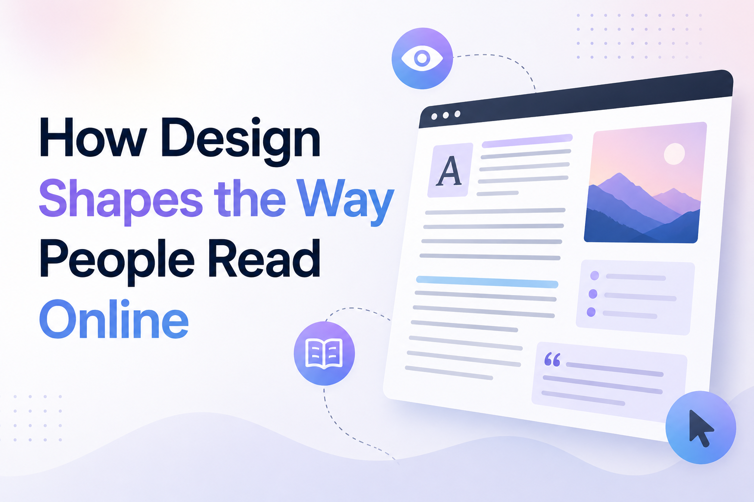
People read differently online than they do when reading a printed book or magazine. When visiting a website, they often scan headings, look for familiar words, check images, and move quickly between sections before deciding what deserves their attention. They may read an entire article, but they usually need a clear reason to do so.
Website design plays an important role in this process. The placement of text, size of headings, line spacing, colour contrast, page layout, and use of images can affect how easily people understand information. A poorly organised page can make even useful content feel difficult to read, while a well-structured page helps readers find answers with less effort.
For businesses, publishers, and content creators, understanding the relationship between design and online reading can improve the user experience. It can also help make important information easier to understand across different devices and reading habits.
Why People Read Differently Online
Online readers often visit a page with a specific goal. They may want to compare products, understand a service, solve a problem, or find an answer to a question. They usually want to know quickly whether the page contains the information they need.
Unlike traditional reading, online reading often involves interruptions. Notifications, open tabs, advertisements, links, and other on-screen elements compete for attention.
As a result, readers frequently scan a page before deciding whether to read it in detail.
A website should support both behaviours. It should help visitors identify relevant information quickly while making longer reading comfortable when they choose to continue.
1. Visual Hierarchy Guides the Reader's Attention
Visual hierarchy refers to the way design elements are arranged to show which information is most important.
Readers should be able to identify the main topic, recognise the different sections, and understand how the information is organised.
Headings Help Readers Find Relevant Information
A clear heading tells readers what to expect from a section. It also allows them to skip directly to the information that matters most to them.
For example, someone reading an article about website speed may want to understand image optimisation without reading every section about hosting or code quality.
Descriptive headings make that possible.
Headings should explain the subject of each section rather than use vague phrases that provide little information. A heading such as "How Image Size Affects Loading Speed" is more useful than "Another Important Factor."
Size and Position Influence Attention
Larger text often attracts more attention than smaller text. Position also matters because readers tend to notice prominent elements before less noticeable details.
A clear page structure usually gives the main heading the strongest emphasis, followed by section headings, supporting text, and secondary information.
When too many elements compete for attention, readers may struggle to identify the main message. A balanced hierarchy makes the page easier to understand.
2. Typography Affects Reading Comfort
Typography is more than a visual choice. It affects how easily people recognise words, follow sentences, and continue reading.
A font may look attractive but still be difficult to read when used in long paragraphs or at small sizes.
Choose Fonts That Support Readability
Websites should use fonts that remain clear across different screen sizes. Decorative fonts may suit a logo or a short heading, but body text generally needs simple letter shapes.
The text should also be large enough for comfortable reading without requiring visitors to zoom in.
There is no single font size that works perfectly for every website. The right choice depends on the font, audience, screen size, and overall layout.
Use Line Spacing to Improve Clarity
When lines are packed too closely together, readers may find it difficult to move from one line to the next. Excessive spacing can also interrupt the flow of reading.
Suitable line spacing creates a comfortable rhythm and helps readers keep their place.
Line length matters as well. Very long lines can make it difficult to return to the beginning of the next line, while extremely short lines can break sentences into too many fragments.
A balanced text width supports a smoother reading experience.
3. White Space Makes Content Easier to Process
White space refers to the empty space between text, images, buttons, headings, and other page elements. It does not have to be white; it simply means space without competing content.
This space helps separate ideas and gives readers room to focus.
Break Up Large Blocks of Text
A page filled with long paragraphs can feel difficult to approach, especially on a mobile screen.
Breaking content into shorter, meaningful paragraphs helps readers process one idea at a time.
For example, a service page can explain the problem in one paragraph, describe the solution in another, and provide supporting details in a separate section.
The goal is not to make every paragraph the same length. It is to keep each paragraph focused on a clear point.
Use Spacing to Show Relationships
Related information should appear close enough together for readers to recognise the connection. Different topics should have enough space between them to feel separate.
This principle applies to headings, lists, images, captions, and call-to-action buttons.
Good spacing makes a page feel organised without requiring additional decorative elements.
4. Page Layout Influences How People Scan
Readers do not always move through a webpage from the first word to the last. They may jump between headings, look at images, scan lists, or focus on the left side of the page.
The layout should make this behaviour easier rather than forcing every visitor to follow one fixed path.
Put Important Information Where Readers Can Find It
The most important information should be easy to locate near the beginning of a page or section.
For example, an article should introduce its main subject early. A product page should clearly identify the product and provide essential details. A service page should explain what the service includes before presenting secondary information.
This does not mean every page must follow the same template. The layout should match the purpose of the content and the needs of its audience.
Avoid Unnecessary Visual Clutter
Too many banners, animations, pop-ups, icons, and unrelated images can interrupt reading.
Each element should serve a purpose. If a graphic does not explain the content, support navigation, or help the reader take a relevant action, it may not be necessary.
A simpler layout can help important information stand out naturally.
5. Colour and Contrast Affect Readability
Colour influences the appearance of a webpage, but its practical role is just as important.
Text needs sufficient contrast against its background so readers can distinguish letters easily. Light grey text on a white background, for example, may be difficult to read for many users.
Make Text Easy to See
Websites should use text and background combinations that support readability across devices and lighting conditions.
The Web Content Accessibility Guidelines (WCAG) provide recognised contrast criteria. Under WCAG 2.2, the minimum contrast ratio for normal text is generally 4.5:1, while large text generally requires 3:1 to meet the relevant AA criteria.
These guidelines provide a useful reference when checking website accessibility.
Do Not Rely on Colour Alone
Colour can highlight links, warnings, or important information, but it should not be the only way to communicate meaning.
For example, a form should not indicate an error only by turning a field red. A clear error message explains what went wrong and how to correct it.
Using text labels, icons, and other visual cues alongside colour makes information easier to understand.
6. Images Can Help Readers Understand Complex Ideas
Images can support reading when they explain something that would otherwise require a long description.
Photographs, diagrams, charts, screenshots, and illustrations can help readers understand processes, compare options, or recognise important details.
Choose Images That Support the Content
A relevant diagram can explain a technical process more clearly than several paragraphs. A product image can help customers understand its appearance. A screenshot can show where a feature is located in an application.
However, decorative images that do not add meaning can distract readers from the main message.
Images should be selected according to their purpose, not simply to fill empty space.
Add Useful Alternative Text
Alternative text, commonly called alt text, describes the purpose or content of an image for people who cannot see it.
A useful alt description should be accurate and specific. It should explain relevant visual information rather than repeat the same keywords several times.
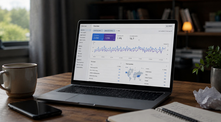
For example, an image showing a person using a laptop to review website analytics should be described according to what it actually depicts and the role it plays on the page.
Charts and diagrams may also need additional text to explain information that cannot be understood from the image alone.
7. Mobile Design Changes the Reading Experience
People often read websites on smartphones while travelling, waiting, or completing other tasks. Mobile screens provide less space than desktop monitors, so the layout needs to adapt.
Make Content Comfortable on Smaller Screens
A mobile-friendly reading experience should include:
- Readable text without forced zooming
- Clear headings and subheadings
- Short, focused paragraphs
- Appropriate spacing
- Responsive images
- Simple navigation
- Minimal horizontal scrolling
- Buttons that are easy to tap
The purpose is not to remove useful content from mobile pages. It is to present the same important information in a format that works well on smaller screens.
Keep Important Information Accessible
Some websites hide useful information behind complicated menus or expandable sections. These features can help organise a page, but they should not make essential information difficult to find.
Expandable FAQs, for example, can reduce page length when implemented clearly. Readers should still be able to identify the questions and understand how to open the answers.
8. Writing Style and Design Should Work Together
Even the best layout cannot compensate for unclear writing. Design and content need to support one another.
Simple language, meaningful headings, and a logical sequence of ideas help readers understand the message without unnecessary effort.
Explain Technical Terms Clearly
Technical terms may be necessary when writing for a specialised audience. However, unfamiliar terms should be explained when they could prevent readers from understanding the content.
For example, a page about website performance can define "caching" as storing copies of certain resources so they can be delivered more quickly when needed.
A brief explanation can help a reader understand the topic without leaving the page to search for a definition.
Use Lists When They Improve Understanding
Lists work well for steps, requirements, features, and related points.
They make information easier to scan, particularly when readers need to compare several items.
However, converting every sentence into a bullet point can make content feel disconnected. Paragraphs remain useful for explaining ideas, giving context, and showing how different points relate to each other.
The format should match the information being presented.
9. Links and Interactive Elements Can Interrupt or Support Reading
Links help readers move to related information, but too many competing links can make a page harder to follow.
A useful link should offer a clear next step or provide additional information that supports the current topic.
Use Descriptive Link Text
Link text should tell readers what they can expect after clicking.
For example, "Read our website maintenance guide" provides more information than "Click here."
Descriptive links help readers understand their options, including those using screen readers that may list links separately from the surrounding text.
Use Pop-Ups and Animations Carefully
Pop-ups, auto-playing videos, and animated elements can interrupt reading if they appear at the wrong time or block the content.
If a website uses these features, they should have a clear purpose and allow visitors to continue reading without unnecessary difficulty.
A good design gives readers control over their experience instead of repeatedly demanding their attention.
10. Page Speed Affects Reading Continuity
Reading requires attention, and slow pages can interrupt it before the content even appears.
If text loads late, images shift while a page is opening, or interactive elements stop responding, visitors may lose their place or leave the website.
Improve Performance Without Sacrificing Clarity
Website teams can improve loading performance by compressing images, removing unnecessary scripts, using suitable caching, and reviewing hosting and code efficiency.
Images and embedded media should also be implemented in ways that reduce unexpected layout shifts.
Google's Core Web Vitals provide useful measures of loading performance, responsiveness, and visual stability. These metrics can help teams identify technical problems that affect the reading experience.
Performance improvements should be assessed alongside usability. A fast page is valuable, but it still needs clear information and a readable layout.
11. Accessible Design Supports Different Reading Needs
People read online in different ways. Some use screen readers, some navigate with a keyboard, and others adjust text size or use browser tools to improve readability.
Accessible design helps accommodate these differences.
Useful practices include logical heading levels, descriptive link text, sufficient contrast, clear form labels, keyboard access, and layouts that remain usable when text is enlarged.
Headings should follow a meaningful structure rather than being selected only for their appearance. A heading should identify a section, while body text should contain the explanation.
These practices improve the experience for people who use assistive technology and can also make websites easier for everyone to navigate.
12. How SEO and GEO Benefit From Readable Design
Search engine optimisation (SEO) helps relevant pages appear in search results, while generative engine optimisation (GEO) focuses on making content clear and useful for AI-powered search and answer systems.
Readable design supports both because it helps people access and understand the information presented on a page.
Organise Content Around Real Questions
A useful page should address a clear subject and answer the questions readers are likely to have.
Descriptive headings, concise explanations, accurate facts, and relevant examples make content easier to navigate.
For instance, an article about mobile website design could explain what responsive design means, why mobile readability matters, and how businesses can check their pages on different devices.
Prioritise Accuracy and Usefulness
Adding keywords to headings does not automatically make content useful. Pages should answer the topic naturally and avoid repetitive wording that adds little value.
Google's people-first content guidance emphasises helpful, reliable information created for users rather than pages produced primarily to manipulate search rankings.
Clear structure can make information easier to interpret, but it does not guarantee a search ranking or inclusion in an AI-generated answer.
13. How Businesses Can Improve Online Reading Experiences
Businesses can begin by reviewing important pages from the visitor's point of view.
A practical review should consider whether the main message is clear, whether headings describe the content accurately, and whether visitors can locate important information without excessive scrolling or searching.
It is also useful to test pages on different devices, check contrast and text size, review loading performance, and ask real users to complete common tasks.
A web designing company in dubai, for example, may need to consider how customers with different reading habits access service information, compare options, and move between pages. The same principles apply to businesses serving audiences in other locations.
Teams such as Inter Smart can consider content structure, visual hierarchy, accessibility, and technical performance together when evaluating how well a website communicates with its visitors.
The important point is that readability should be part of the design process from the beginning, not a correction made only after a website has been launched.
Helping Readers Focus on What Matters
Website design shapes the way people read by guiding attention, separating ideas, and making information easier to understand. Typography, spacing, contrast, images, navigation, and page speed all contribute to the experience.
When these elements work together, readers can find answers more easily and spend less effort dealing with unnecessary distractions.
A useful website does not try to make visitors read every word on every page. It helps them identify relevant information, understand the main points, and decide what to do next.
When Design Makes Reading Feel Natural
The most effective online reading experiences often feel simple because the design supports the reader at every step. Headings explain what comes next, paragraphs communicate one idea at a time, and visual elements provide useful context without competing for attention.
Businesses that treat readability as a core part of website design can make their content more accessible, useful, and comfortable to read.
Ultimately, good design does not replace good writing. It gives good writing the structure and space it needs to communicate clearly.